The most common conventions of a thriller:
Antagonist - Villain
Protagonist - Hero
Victims
Suspense
Enigma
 |
| Going from left to right 1 - 9 |
For our title sequence we decided to keep it simple, we thought that going to all lengths with complex titles would distract from the opening itself. This opening part shows the distributors and we decided to make our own called 'HEH Productions', which was just the first letters of all our names, and then use our college name in the next.
Shot 2
We thought that this for our establishing shot would clarify where we were, and what time of day it was. It then tilts down where we first see our main character, at this point the audience don't know whether Haydn is the antagonist or protagonist. This gives our opening the first dose of enigma.
Shot 3
This long shot could suggest that someone is watching him, there are two flashes/jump-cuts that show passing in time. However, audience we showed, confused it with a camera flash. By this shot we can see that he is a middle class working man by the briefcase and his costume, later in this shot it shows his car, which a lower class person
probably wouldn't be able to afford. Haydn seems to be in a vulnerable state as this shot makes him seem insignificant, this leads to him getting taken by an unidentified subject, we decided to keep the identification of the attacker unknown till later because this adds to the mystery.
Shot 4
For our opening to make a little more sense, we needed to include a shot of the bank that the audience would assume Haydn works at, and by Haydn's costume, they could also assume that he has a high position. In the post-production process we added filters to make it look like a flashback, took away the original sound and inserted a heartbeat, which could be his. This shot gives the audience the idea that this bank had something to do with why Haydn was attacked, and that the attacker and him had some trouble between each other.
Shot 5
This is the last part of our title sequence, deciding to have it after the attacking scene as it kind of acts like a cliff hanger. The audience don't actually see the kidnapping so they are waiting to see what happens, this delays that and tells them the title of the opening. We also decided to keep the text characteristics the same as the first two titles so it keeps continuity. This shot then leads into an off-screen sound effect of a crate door opening and shutting, suggesting that the, who we expect to be the antagonist walking in. We tried to keep the identity of him under-wraps for as long as possible, until the interrogation begins, in which we see his face for the first time.
Shot 6
This close up of Harry's hand gives us the first glimpse that he is getting angry, the audience would take that as a warning sign that something bad is about to happen. Also at this point we get the idea that Harry is in fact a possible victim in this situation and Haydn is the villain. The mentioning of Harry being in prison suggests that Haydn was the cause of this and maybe some betrayal was involved. Even though Harry, being bigger and more threatening than Haydn, looks like he would be the antagonist, it turns out to be the other way round.
Shot 7
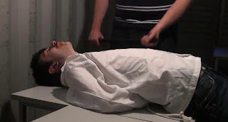
We wanted to do a scene where it shows Harry being tougher than Haydn. This medium shot clearly shows us that Harry is much taller, and Haydn is put into a vulnerable situation.
Shot 8 and Shot 9
These last two shots put the audience at their most tense state, we can clearly see that Harry is by far the most threatening. At this moment Haydn might feel regret for doing what he apparently did to Harry. The audience could feel sorry for Haydn, but we don't yet know exactly what the situation, only that it involves money and prison. We

decided to end it where we did as it leaves it on a cliffhanger, does Harry kill Haydn? Does Harry get the money? Do either of them succeed? I believe it's clear that our opening follows the conventions of a thriller.
2. How does your media product represent particular social groups?
Our media product doesn't really cover many social groups, but there is one obvious one, gender.
Our opening doesn't contain any women, only two men, one of a lower class, and one that is of middle/high class. People may think it's stereotypical to have two males involved in a bank robbery, as they are the 'stronger/braver sex'. This is not correct as female criminals are just as capable of robbing a bank as men. But even though I think this, I also believe that if we did have females or for example one female and one male, it would of been highly likely that it would be the female that would be in Haydn's position. If it was the other way round, the film would have a totally different feel to it, and maybe even less threatening.
Examples of strong female characters:
Lara Croft
Catwoman
Alice (Resident Evil)
Katniss Everdeen
3. What kind of media institution might distribute your media product and why?
I have looked at different UK film distributors such as 20th Century Fox, Icon and Sony Pictures, and I have decided that Sony would probably be the most suitable choice. This is because Sony are a huge company that relate to many different areas of the media like, gaming, photography, TV and more.

I think the gaming side of Sony could be helpful with our thriller as our opening would mostly steer towards males rather than females, this is because films with crime and fighting involved is more of male surrounded genre. Men are 60% of all the game users and if trailers of our film could be shown on gaming channels, and websites this could be a easy way to get the word out. Sony is linked to Love Film and Netflix on the Playstation 3, so Sony could get a bit of profit if they distributed out film through one of these sites.
If we were to release to the cinema with the help of Sony, I think that the film would be released in smaller scale cinema's like 'Vue' or 'Odeon', these cinemas aren't as well known as 'Cineworld', but I wouldn't give our film out to an Arthouse as these only show the lower budget films and only distribute to a couple, or even one area of the UK. The cost of distributing our film to a top-end cinema would be pretty high, this is a downside of releasing to cinemas. One celluloid film costs around £1800, and to do a large release can cost up to, and over 1 million.
4. Who would be the audience for your media product?
I would aim our thriller to an age group between 15 and 25 and mainly male, as thrillers usually attract a male audience instead of female. Our thriller is very British and would probably appeal more to a UK audience than a American audience. American thrillers tend to involve more violence in the sense that it is much more common to see a lot more guns in US thrillers than UK. There are many sub-genre's in thrillers, such as crime and psychological, examples being:
 |
| The Eye - Psychological |
 |
| Sin City - Crime |
I asked 50 men if they would go see a thriller film in the cinema.
I then asked 50 females and the result was quite different, therefore providing evidence that men in the target audience are more interested in thrillers than women in our target audience.
5. How did you attract/address your audience?
I thought that Facebook would be the best bet of attracting our target audience, as they're from the ages of 15-25, these age groups are regularly using social networking sites such as this. I posted our thriller opening on my Facebook account and asked for any type of feedback. These were two interesting responses that I received, one female, aged 18, and one male, 23.
6. What have you learnt about technologies from the process of constructing this product?
- When we first shot out interrogation scene, we didn't use much shot variety, this made the scene very boring as it was the same shot one after the other. The lighting and location were not perfect either, so we decided to re-film this particular scene to make it more visually appealing.
- I also learnt that sound is a very important factor in the making of a film, while editing we didn't concentrate on the sound as much as we should have. Such things like foleys could of been added to make Haydn's footsteps in the first few shots a bit louder.
- Something I would of done differently when we first put the recordings on the macs would have been naming all the different pieces of video and deleting things we didn't need, as it was a bit difficult trying to find a certain clip, being more organised when editing would of sped up the process.
- Continuity was a huge part of editing our opening, we needed to make sure that all the cuts were clean. Some cuts of the opening are a little sudden, this was either because we stopped filming too early or that we accidentally cut away a little too much while editing. I have therefore learnt that continuity is a very important thing to pay attention to and that the more takes you do on a shot, the better the product outcome.
7. Looking back at your preliminary task, what do you feel you have learnt in the progression form it to the full product?
Preliminary task:
Camera:

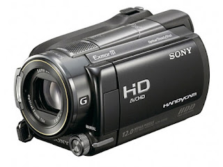
As we were filming our opening, we got to use the Sony HD cameras, this was a massive privilege and made filming much easier. We did a few test shots, playing around with the focus pull so we could find out how it worked and tried to decide how we would use it in our film. We as a group learned how to use these and import them onto the macs. Picking up on how everything worked on it was pretty simple in the end. Compared to the tape cameras we used for our preliminary task, I much prefer these as they are much easier to import and use in general. Tape camera's were difficult as we had to do 'capture scratch' to get all the footage. This was very time consuming as we had to watch what we just recorded while it imported, which was usually a lot.
Editing:
Once we filmed everything we needed, we uploaded it all onto Final Cut Pro, this programme is used by Hollywood film editors and is a very high tech piece of equipment. This meant that it was probably the hardest thing to figure out and use during the whole of this project. We first used it during our preliminary task, so we were okay with the basics. But knowing we had to make it look professional, we had to make use of its ability as much as possible.


